If there’s one thing that IT is really good at, it’s creating data. Like, a lot of data! As an example, take all the platforms that your organisation has deployed specifically to address an enterprise process workflow – HR, finance, IT ops, manufacturing, etc. There’s a lot of incredibly rich data in these systems but they’re often stored in silos making it difficult to understand what you actually have, how much you can harness, and whether it’s of value to your business.
This is where we come in. ManagementStudio brings together different data points in a unique way to help answer questions like, “which regions have the most devices that pose a security risk?”, and “which apps are under utilised by the UK finance teams?”. It’s incredibly powerful stuff and we’re often asked how this valuable insight can be used in other tools.
One of the little known features of ManagementStudio is our support for JSON endpoints. It might not sound that exciting but this means you can now access the incredibly rich, constantly evolving data source you have in ManagementStudio through other applications like Microsoft Power BI.
No more static file exports.
No more reports that age as soon as they’re sent.
Just accurate, real-time data.
Sound good? Let’s get started!
Example: Time in Process
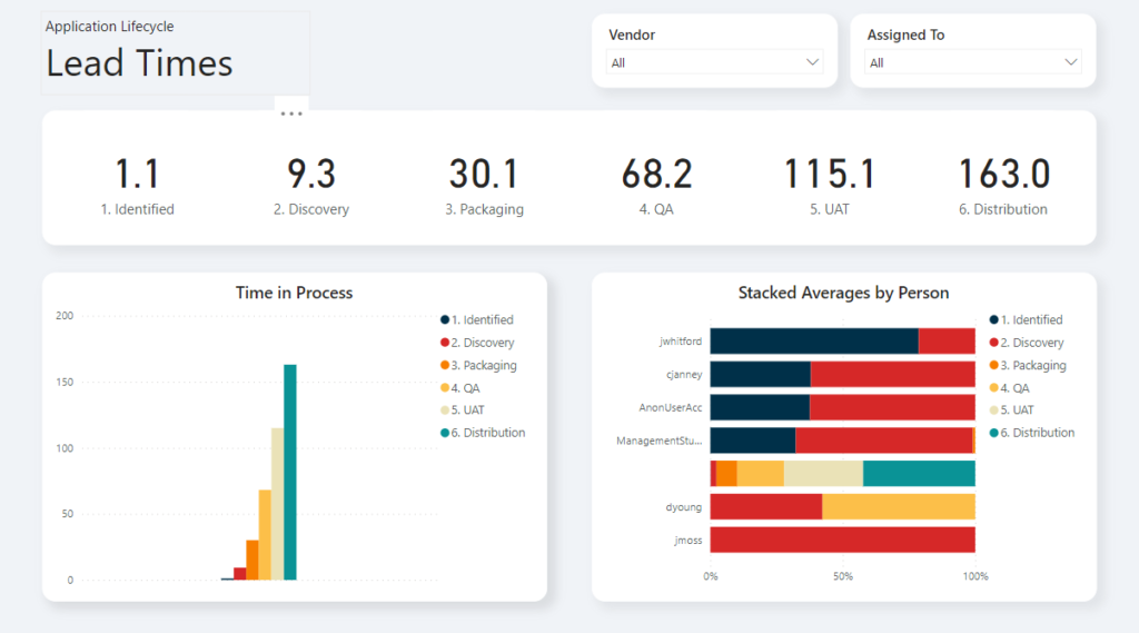
As the title of this blog suggests, I’ll be showing you how to integrate the data from ManagementStudio into a Power BI report. This particular example will show the average amount of time that applications have spent in each part of the workflow (useful for understanding Service Level Objectives) but the concepts apply to any data that can be modelled in ManagementStudio.
All the steps you need are below but you can download the finished report that contains additional formatting.
Prerequisites
Microsoft Power BI
I’m using Microsoft Power BI Desktop in this example, which is available as a free download from https://www.microsoft.com/en-us/download/details.aspx?id=58494.
A working knowledge of Power BI would be useful but the article does have screenshots to help anyone that’s new to the product.
ManagementStudio
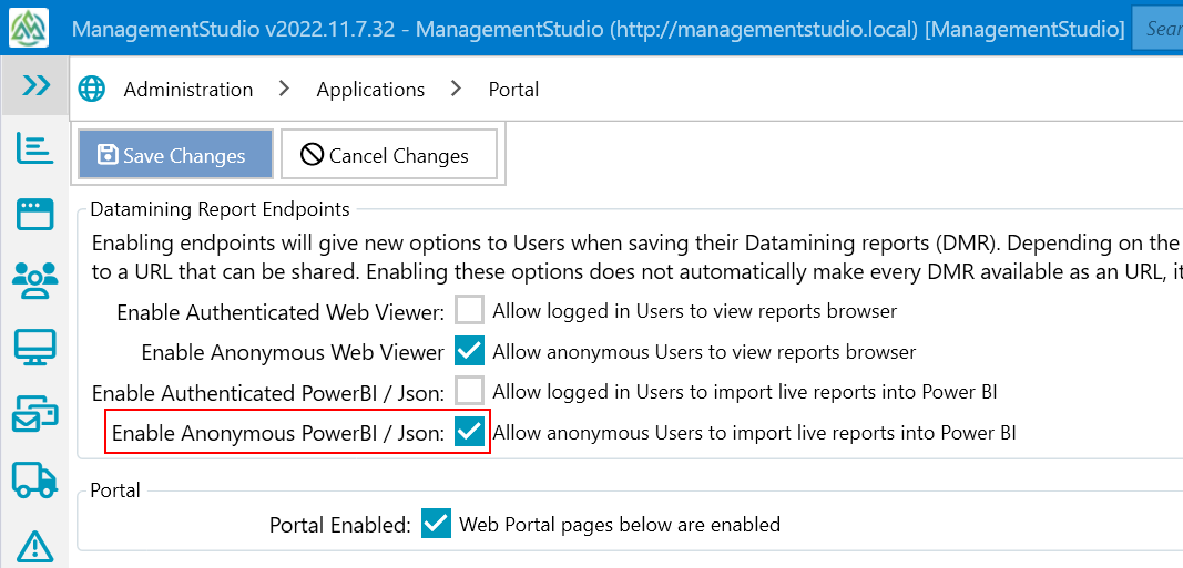
For Power BI to be able to access ManagementStudio data, we first need to enable access via the Portal. This is set in the Administration section under the relevant module. In this example, we’re creating a report based on application data so we need to view the portal configuration for the Applications module: Administration > Applications > Portal
The setting that you’re looking for is called Enable Anonymous Access in the Datamining Report Endpoints section. This isn’t a blanket unlock – we still have to specify which reports we want to import into Power BI (we’ll do this in a later step) but this provides external access the datamining engine.
Note: If you would like to use authenticated endpoints, please refer to the Datamining Report & Power BI Endpoints solution article on our support site.
Preparing the Data
We’ll be using a Datamining Report (DMR) as the data source for Power BI. We’ve done it this way to make it incredibly simple to create focused data sets: everything is done in the ManagementStudio UI, there’s no SQL or coding to learn, and they’re incredibly easy to update.
Let’s start in the Applications module (#1 in the image below) and click the Datamining Report button (#2) from the main ribbon:
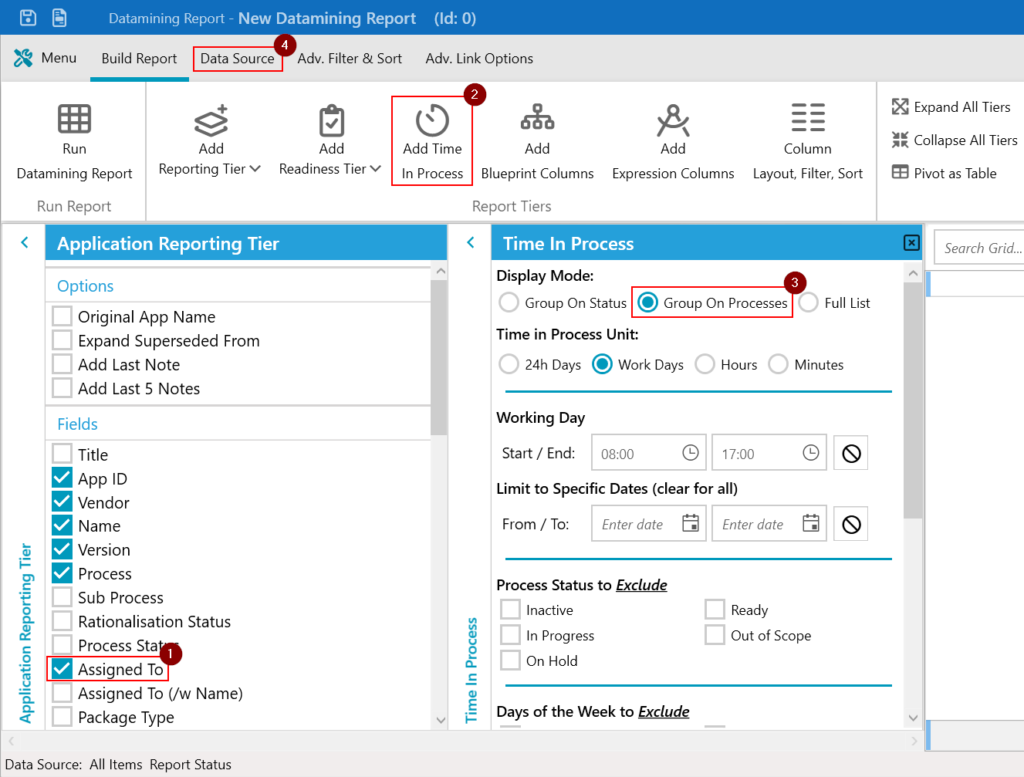
The DMR will open with the Application Reporting Tier enabled already. We’ll keep the default field selection and add Assigned To (#1). Click Add Time in Process (#2) and change the Display Mode to Group on Processes (#3). Once you’re happy with the settings, tap the Data Source tab at the top (#4).
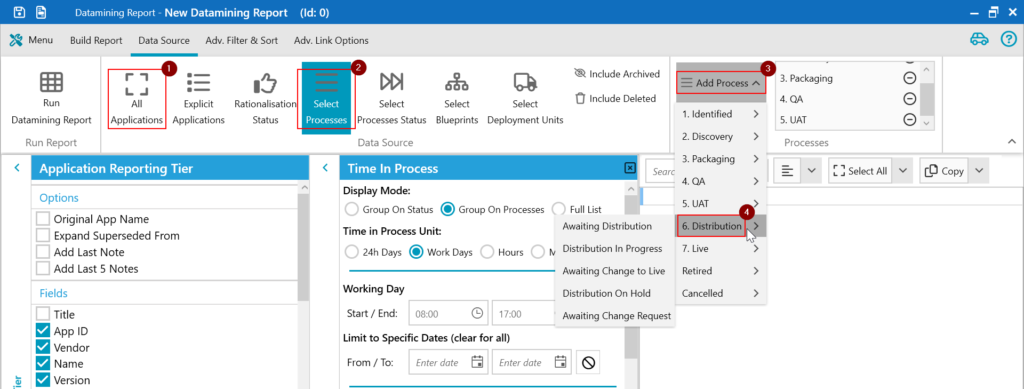
I want this report to show me how much time is spent on average actively working on applications, so I only want to focus on specific processes. We’re already in the Data Source tab so go ahead and:
– Deselect All Applications (#1)
– Enable Select Processes (#2)
– Click Add Processes (#3) to open the process selector and choose the parent level process (#4). In this example, I’ve selected:
- 1. Identified
- 2. Discovery
- 3. Packaging
- 4. QA
- 5. UAT
- 6. Distribution
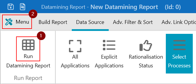
OK, our data is nearly ready. At this point, feel free to test the report by clicking the Run Datamining Report button (#1) and making any changes that you might need. If you’re happy, save the report by opening the Menu (#2) and choose Save As.
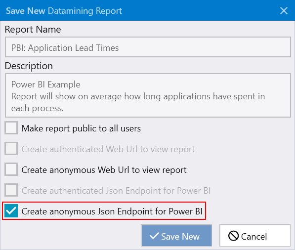
Fill out the Report Name and Description fields, and ensure that the Create anonymous Json Endpoint for Power BI option is selected at the bottom. Without this, Power BI won’t be able to talk to ManagementStudio. Click Save New to save the report.
The Power BI Endpoint Address
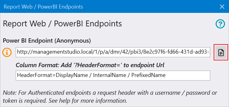
Now that our data is ready to go, the last thing we need to do is make a note of the endpoint address for this DMR. Click the Menu button again but this time, select the Web / Power BI Endpoint option.
The endpoints management window will open. Click the icon to the right of the Power BI Endpoint (Anonymous) URL to save the address to the clipboard.
Connecting to the Data in Power BI
We’ve finished with ManagementStudio for the moment and it’s time to start working with our data in Power BI Desktop.
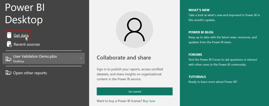
The easiest way to connect to our data is to launch Power BI and use the connection options in splash screen. Simply click Get Data to launch the data selector.
Or, if you’re already in Power BI, switch to the Home tab (#1) and select Get data (#2) from the ribbon.
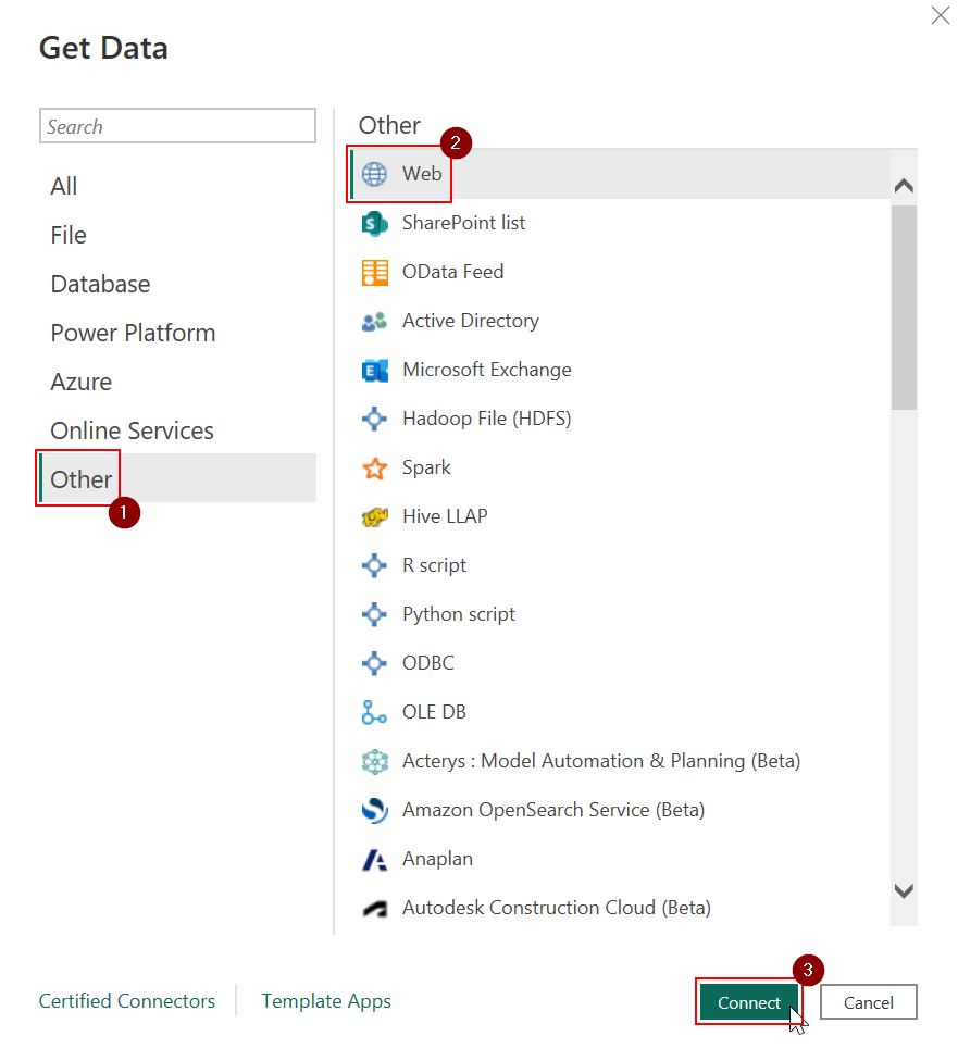
Whichever method you chose, the data selector should open in a new window. Click Other (#1) from the left panel and choose Web (#2) from the list of data source types. Hit Connect (#3) to confirm your choice and move to the next step.
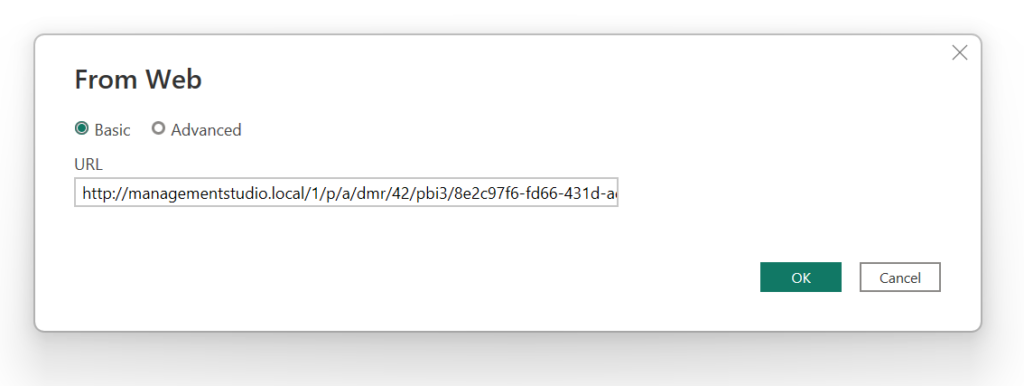
Next we need the Power BI endpoint address that you saved earlier. Paste that into the URL field and click OK to continue.
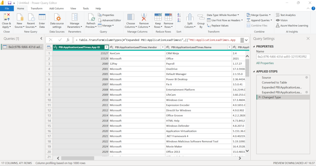
If everything is configured correctly, Power BI Desktop will establish a connection to ManagementStudio and load sample data from the DMR that we created earlier.
A bit of housekeeping
We could get straight to work with the data as it is but there are a few changes that I like to make in the Power Query Editor to make the design stage a little easier.
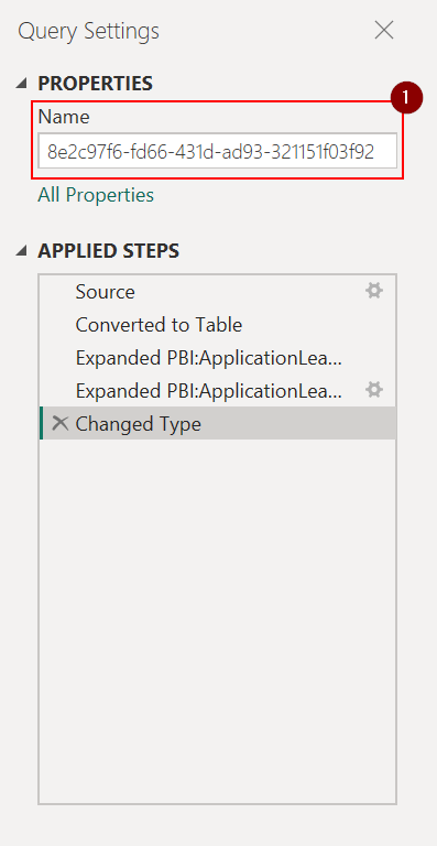
Let’s start in the Query Settings panel on the right. You’ll notice that Power BI has set the query name to a randomly generated a GUID (#1). Make it part of your PBI workflow to set this to something more meaningful – it’s going to make life much easier when you’re building advanced reports that have multiple data sources!
You might have also noticed that the grid column headers use the format [ReportName].[FieldName].
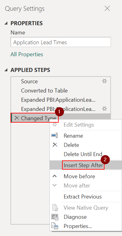
This can make things a little tricky to work with later, so we’ll add a transform to remove the report name from the column header. To do this, we’ll stay in the Query Settings panel but we’ll be working in the Applied Steps section:
- Right click on the last step in the list (#1)
- Select Insert Step After (#2) from the pop-up menu
This adds a new step called Custom1 to the list of steps:
- Right-click Custom1 and select Rename from the pop-up menu
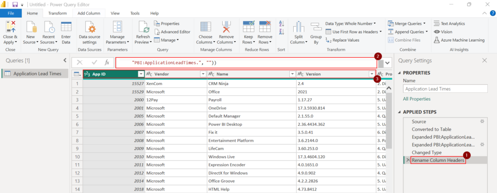
- Set the step name to Rename Column Headers (#1) and press the Enter key
- Enter the following text in the formular bar (#2) above the grid:
= Table.TransformColumnNames(#"Changed Type", (columnName as text) as text => Text.Replace(columnName, "PBI:ApplicationLeadTimes.", ""))
- The column headers will now show only the field name (#3)
Note: My ManagementStudio DMR was named PBI: Application Lead Times, but you would need to update the formula above if you saved yours with a different name.
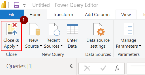
There’s more that you can do here, like choosing which columns to use in the query or changing the column data type, but for now we’ll just click Close & Apply (#1) from the ribbon to load the Power BI Desktop designer.
Creating a basic Power BI dashboard
The key information that I want to include in my report is the average number of days that my applications spend in each process:
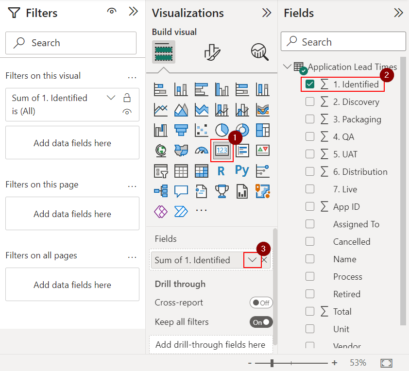
I’ve created these using the Card visualisation and you’ll need to repeat these steps for each of the processes in your application lifecycle:
- Click on a blank area of your canvas
- Click the Card icon (#1) in the Visualizations panel to add a blank Card to your canvas
- From the Fields panel, select the process (#2) that you want to report on
- By default, the query will return the sum of the time applications spend in that process, however, we want the average time. To change this, move back to the Visualizations panel, click the down arrow to the right of the field name (#3) and choose Average from the pop-up menu.
- Use the down arrow (#3) again but this time select Rename from the pop-up menu and remove the text “Average of”. The text used here will appear in the visualisation.
Tip: Create a new Measure to calculate the average and add a catch for processes that don’t contain any data. This will save changing the type in future steps. For example:
M1_Identified = AVERAGE('Application Lead Times'[1. Identified])+0
Now is the perfect time to make any other changes to the Visualization, like font type and size.
Let’s just pause for a moment because right now, you have successfully imported data from ManagementStudio into Microsoft Power BI. Any changes to the ManagementStudio data will be replicated in Power BI with a simple refresh.
Of course, there is a much that you can do with Power BI. If you’re looking for more ideas, I’ve provided a few more examples below.
Other Enhancements
Using Charts
Charts are an incredibly effective way to easily communicate complex data or trends. I’ll be adding two charts to the canvas – the Clustered Column Chart and the 100% Stacked Bar Chart – to provide different ways of representing our time in process data.
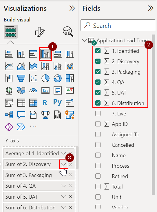
Clustered Column Chart
- Click on a blank area of your canvas
- Select the Clustered Column Chart (#1) from the Visualizations panel to add it to the canvas
- Select all the processes from the Fields panel (#2) that you want in your chart
- Back in the Visualizations panel, click the down arrow (#3) next to the field name to change the value from Sum to Average
- You could also remove the “Average of” text using Rename for this visualisation in the same menu to simplify the chart’s legend
- You will need to repeat the previous two steps for each process in the Y-axis
As with the Card visuals, you may want to apply additional formatting to the chart.
100% Stacked Bar Chart
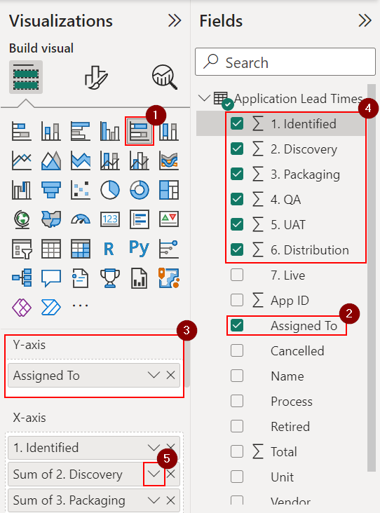
I’ve used this chart to show which team members are involved the most in each stage of the application lifecycle. This is similar to the step above but we’ll need to add the field containing the team information to the chart first:
- Click on a blank area of your canvas
- Select the 100% Stacked Bar Chart (#1) from the Visualizations panel
- In the Fields panel, click Assigned To (#2) and check that it appears in the Y-axis (#3)
- Go ahead and add all the fields that we’re interested in (#4)
- Click the down arrow next to the field (#5) to change the field value to Average and remove the “Average of” text using Rename for this visual (as before, you’ll need to repeat this to all the fields in your visualisation)
Apply any additional formatting, such as changing the font type and size.
Segmenting Data
Possibly my favourite visualisation in Power BI are Slicers. These allow you to carve or ‘slice’ your data in a way that allows you to view subsets of your original data and drilldown into finer detail. I’ll be adding two Slicers to my report to allow me to filter results by vendor and team members.
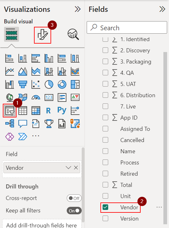
Let’s start with the vendor Slicer:
- Click on a blank area of your canvas
- Head over to the Visualizations panel and click the Slicer icon (#1)
- Select Vendor (#2) from the Fields panel
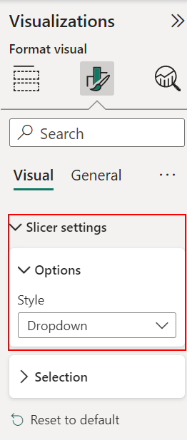
- Open the formatting options (#3) for the Slicer
- Move to the Visual tab, expand Slicer Settings > Options
- Change the Style to Dropdown
Make any other formatting changes to the slicer and reposition it on the canvas.
The steps to add the second Slicer to filter by team member is the same as above, except we choose Assigned To in the third step when selecting the field.
Wrap-up
One of the primary goals of ManagementStudio is to create a single version of the truth for your business and keep it up-to-date. Being able to connect to your ManagementStudio data from external sources via JSON offers another way to eradicate errors caused by inaccessible data silos, out of date reports, and people simply using the wrong version.
We’ve only just scratch of what’s possible with ManagementStudio and Power BI, but I’ll be bringing you more articles in the future that will that explore new ways of presenting and sharing data. Don’t forget to sign up to our newsletter (you can do that below) to be the first to hear about new ideas to enhance the way you deliver services to your end users!
If you have any questions about this article, we would love to hear from you! Leave a message for us by visiting our contact page.

